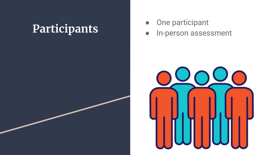
For my Human Systems Integration course that I completed in Spring 2024, we were tasked with choosing an application and conducting a small-scale usability study on it. I chose Discord for mine. My usability study was conducted in-person with one participant, who doesn’t use the platform very often and isn’t very familiar with all of the features and settings it offers.
In case you’re unfamiliar, Discord is a social media platform quite similar to Slack and Microsoft Teams. Discord’s primary audience is teens and young adults who play video games, but I’ve seen multitudes of people outside of that demographic use and enjoy Discord. Discord is highly customizable, with each server being different from the last one.
The platform is intuitive and easy to use, and – as mentioned before – is similar to Slack and Microsoft Teams, which makes learning to use Discord a relatively seamless experience with little to no learning curve for new users. Discord, whether it be through servers and group chats or individual direct messaging, makes it easy to quickly connect with friends, family, loved ones, and even students. Even though it was most likely created with that aforementioned primary audience in mind, it can be morphed into a unique experience for each user while still being simple and intuitive to use. This is precisely why I chose to evaluate Discord.
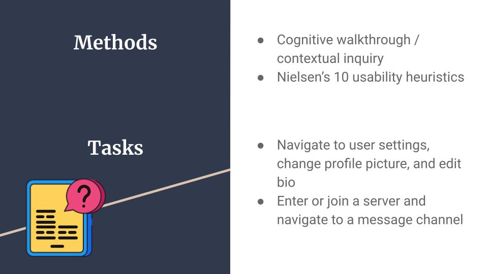
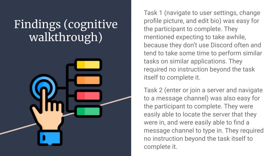
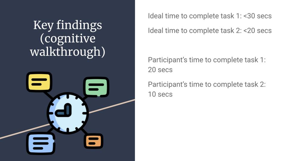
As for the methods of evaluating the usability of the platform, I chose two. The first method I used in my usability assessment is a cognitive walk-through or contextual inquiry. I will had my sister, who has a Discord account but doesn’t use the platform very often, navigate through the platform and complete a specific task like joining a server and sending a message in a specific channel. She’s had an account for a few years but never really uses it so she doesn’t have a lot of experience with the platform, which makes her a good candidate for a cognitive walk-through or contextual inquiry.
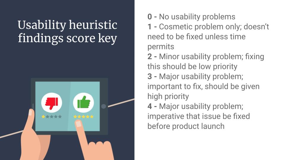
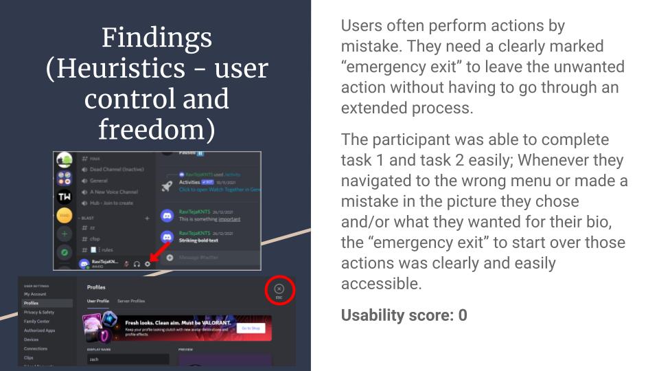
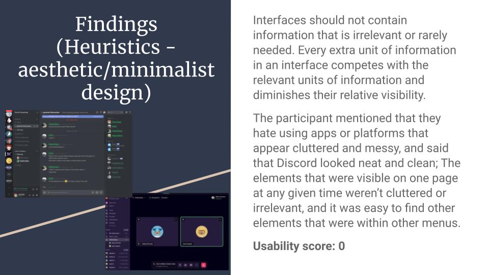
Alongside using a cognitive walk-through or contextual inquiry, my second method I will be using in my usability assessment is a heuristic evaluation using Nielsen’s usability criteria – most specifically user control and freedom; recognition rather than recall; flexibility and efficiency of use; and aesthetic and minimalist design. I made note of which parts of the task are easiest to do and why that might be the case, as well as which parts of the task were the most difficult to complete.
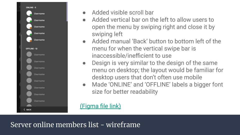
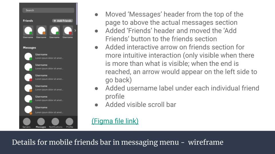
Check out the slideshow below of the presentation showing the findings, and even some re-design ideas for the Discord mobile app with bullet points illustrating what was added or changes. Here’s a link to the Figma file too if you want to check out the wireframes in more detail: Figma Wireframes


Leave a comment